

Theming
Theming
Velum Studio's whole look comes from one small set of design tokens. A theme is a JSON file that sets some of them; everything else comes from the theme it extends. A useful theme can be three lines.
Make one in a minute
- Open Appearance (the gear in the top-right corner, or Ctrl+,).
- Pick the theme you want to start from and click New theme…. Theme Studio opens with a new theme based on it, already saved in your themes folder.
- Change a few colors. The whole app follows as you drag, and the file is saved a moment after you stop.
To change one of your themes later, select it in Appearance and click Edit theme…. Built-in themes can't be edited in place; make a new theme from them.
What Theme Studio writes
The same small file you could write by hand:
{
  "format": "velum-theme/1",
  "id": "my-studio-dark",
  "name": "My Studio Dark",
  "author": "",
  "appearance": "dark",
  "extends": "studio-dark",
  "tokens": {
    "color.accent": "#FF375F",
    "color.accent.hover": "#FF5E73",
    "color.accent.pressed": "#EC1C51"
  }
}
Open it in any text editor at any time, even while Theme Studio is open: every save applies instantly, and Theme Studio picks up what you changed.
The two built-in themes
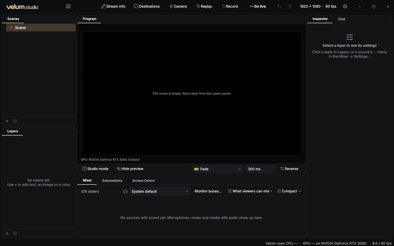
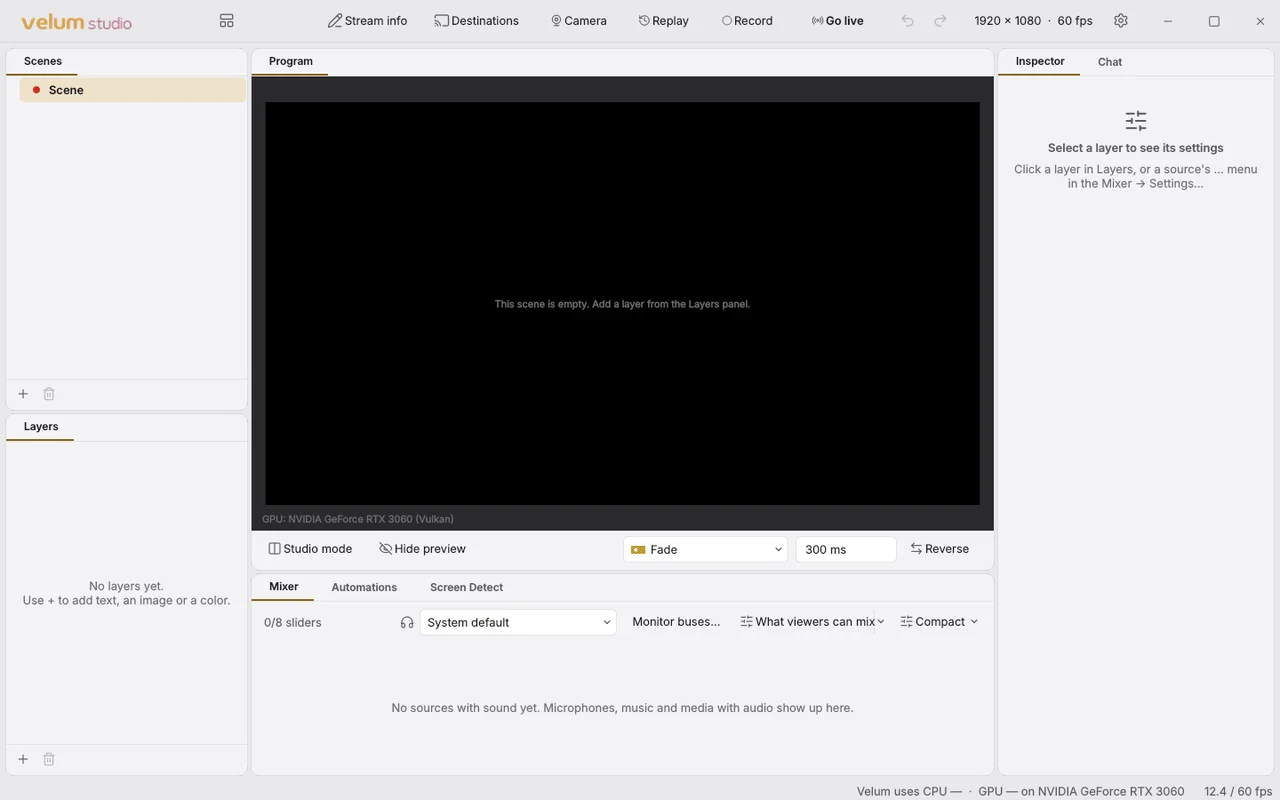
Studio Dark sets every token. Studio Light extends it and sets only what changes for a light appearance, which makes it the best example of how small a theme can be. Both ship as .velumtheme bundles, read by the same code as yours.
Where themes live
| OS | Folder |
|---|---|
| Windows | %APPDATA%\CLEARLYlogic\Velum Studio\themes |
| macOS | ~/Library/Application Support/com.legendremedia.velumstudio/themes |
| Linux | ~/.config/velum-studio/themes |
Drop a .json file in and it shows up in Appearance. A .velumtheme installs with a double-click.
One contract for everything
The tokens are the same contract extensions read. Every color, size and font an extension draws with comes from the active theme, never from literals, so a theme restyles every reviewed extension along with Studio itself. That's the whole point of the token-only rule.
In this section
- The theme file: fields, values, references and inheritance.
- Every token: each token, what it's for, and its value in both built-in themes, generated from the themes themselves.
- Theme Studio: the editor, its checks and its starters.
- Contrast and accessibility: the pairs Studio checks, and the status-color rule.
- Sharing: .velumtheme: packaging, installing and signing.
- Tokens in extensions: CSS custom properties, the QML singleton, and the native API.